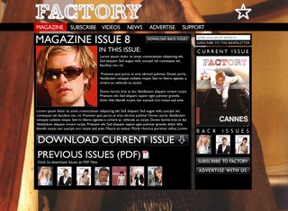
Martin came back to us and decided that the design below is the one we should go for, which we were pleased about:

So we have started to build the content of the site using Cascading Style Sheets. My role has mainly been to build the template using CSS, and to create the Access databases, mailing list, subscribe and contact forms. This has been really useful for me, as I am new to CSS and ASP.net for the databases. It has been a steep learning curve. Nic has been looking into the News blog and tweaking the CSS and formatting, which has been important to get the site layout correct.
I was pleased with my first go at CSS as we ran it through the W3C Webstandards validation and it came back validated and error free.
For the rest of this week, we will finish placing the content into the site, checking the layout, testing it, for the Friday deadline. We have a meeting with Martin at Atticus tomorrow to discuss the progress of the brief, and next week we will present it to the client.
