Friday, March 23, 2007

Graduation Show

We had our Graduation Showcase at the City Canteen & Bar, just a few doors along from D10. The show had been alot of hard work for everyone involved. Myself and Nic took on the role of overseeing the show, Aled and James designed and built the graduation show site, Lindsey, Carol and Nic all looked at the design for the flyers, Gareth and Rob cut the showcase to be shown via mac as well via Bluetooth to mobile phones, Tom helped to build the LED lights that we had for the show and with the equipment, and Shamim with making sure that the D10 studio was ready for the Mygo House demonstration. It was all hands on deck on the day. Myself and Nic went to the printers to pick up the posters. These posters were good in the sense that everyone had designed their own business card, and these were all together on the poster - each card being perforated so people can tear off each one separately. We only had a few hours to spare before the start of the show, but we had all the flyers ready for beginning of the showcase. James had done really well at obtaining 3 Apple macs for the show. These were on the middle table, along with a few laptops, so that people from industry could look at our portfolios.

We had the Orball flash game on a large Plasma screen, and our digital stories were all on a dvd played through a projector. At 2 points in the evening the Mygo 'House' team, demonstrated the game a few doors up at our D10 office. This worked well, as it requires participation by the user to get the full experience of the game.

All in all the night was a success, and I think that people from industry were suitably impressed. I had a few chats with various people, be they freelancers or from companies around the Bay. I also had a chat with someone who used to be the head of S4C. It was a great environment for everyone to chat and show their work and I was really pleased with how it went. It was a fitting end to my D10 journey.

Portfolio Website

I have finished my portfolio website. I went for a clean style, using CSS and Php for the contact form. This site is a portal to view all my work whilst on D10. All of us on D10 completed our sites in time for the Graduation Show, and mine can be viewed at zoebritnell.co.uk

Unique Media

We had a presentation by Unique Media, who are based in Bristol. For the first part they talked about general issues to do with encoding and media formats on the web. One point was made that although the quality on the web of video is not as good as on TV the consumer doesn't generally mind because they can choose what and when they watch something on the web. However, if that quality of video was on a dvd or on tv, then the consumer would mind. I think there is alot to be said for consumer choice - if we feel like we have a choice of what to watch, then we will accept that the quality of the picture is not as clear as on tv.

Having said that, Unique Media did go into some detail on how to encode well, and the importance of correct formats and compression, to give the user the best experience.

One point was that when shooting, obviously continuity is very important, as if you retake a shot the speaker and props must be in the same place. This is obvious, but easily overlooked. Another point is that you can start on a wide shot for an intro, and then stop the person talking and zoom into a tighter shot and then they can continue speaking. Cutaways are also vital to a completed piece. Unique Media like the Windows Media file format to export the video as it is good quality and has a wide hosting support. I personally like the Flash format, but it can be more expensive to host and difficult to scale up.

Thursday, March 22, 2007

Greenfield and Bluetooth

We had our graduation show yesterday, which was very successful - more on this later. Firstly, Rob Light at Greenfield gave us a presentation about mobile marketing and bluetooth technology. The outcome of this connection with Greenfield was that they supported us on a graduation night by letting us encode our D10 showreel with exerpts of all our animations and other screenshots of our work, to be in a format that could be sent to mobile phone via bluetooth. Therefore, whoever came to our showcase last night could access this showcase directly to their mobile phone via their bluetooth connection.

The beauty of bluetooth is that you can receive multimedia information such as adverts, event info. etc via wireless free of charge to your mobile.

Rob Light told us about mobile marketing, i.e. promotional material sent to consumers, usually that you have to sign up for. They have tried this out, for instance, at a rugby match where consumers are notified how to get the information via their mobile and then have access to future events match details.

I like how this way of marketing can be very useful at events, as we found out at our graduation showcase. Also that you have to register, so you don't have unwanted adverts on your phone. For my final module on D10 I researched about the potential impact of multimedia in the developing countries and its use for education, essential information. There is quite alot of scope for mobile phone and bluetooth technology to take off in these countries. I could see the potential for health, education and agricultural information to be downloaded to users, so they can have direct access to essential information that helps their communities.

Sunday, February 18, 2007

2 Man Mission Complete

Myself and Lindsey presented our completed Flash timeline to our client. Overall, he was very pleased with the outcome. We gave him some copies of the cdrom of the timeline, and it seemed to work well on his older version of PC. He liked how when you click on e.g. community, a new timeline background slides into view. The popups were just how he liked them, and were clear as when they are clicked on to popup, everything else on the timeline is faded into the background. He especially liked the interview for which he had given us assets for, as it made the story more personal. One point he did make was that at first it is not completely clear what the user has to click on. However, he did say that the pulsing speechbubbles makes it alittle easier to understand that you need to click on them.


For future development we could enhance the instructions by showing an animation that demonstrates what the user has to do to view each story. It was discussed in the meeting with the client, that in the future we could add more interviews to the cdrom, if he has more assets, i.e. more photographs of each interviewee.


This is the completed look of the timeline:

The timeline can be viewed online at:

http://www.d10dev-studio.com/ZoeBritnell/cdweb/howfar6.html

Friday, February 16, 2007

2 Man Design and Testing
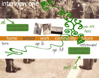
This is an initial design for the timelines:


This was the design that we decided to have for the timelines.


It varies for each interview, depending on the assets that we were given. We only had photos from the person who grew up in Hong Kong (interview one, on the timeline online). This was great to have actual photos of the person, and it was unfortunate that the client was unable to obtain photos for the other 2 interviewees.

This is the menu design for the How far? timeline:
This is an example of the design for a popup which appears when the user clicks on a speechbubble:


When we user tested the timeline, the following points were raised:
It isn't very clear to click on the speechbubbles.
The writing for the interview one in white looks too much like a button.
To resolve this we made the speechbubbles 'pulse', i.e. get larger and smaller so you notice them as interactive. We also changed the font on the interview one, to match that used on the jpg images, so it doesn't look like a button.
Overall, people liked the way the timelines worked, and thought that the design and functionality was good.


2 Man Brief Mission Build

The build of the Flash timeline for the Riverside charity began with the development of the a sliding menu. This fitted in well with what we needed to achieve for displaying each interview. I also developed an XML file to store all the text for the interviews and to dynamically pull in the jpg files for the images in the timeline. It was a very good exercise to learn more about XML, and how to structure the file and pull in information dynamically. We eventually decided to have 5 separate images for each section of the interview, i.e. for Home, School, Work, Community, and Future. There is also a separate background for each interview.

Final Design and Game for Mygo


This is the final design for the Mystery House game -
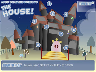


This can be viewed online at:

http://www.d10dev-studio.com/AledBartholomew/mygo/house.html

Today we had a video conference with Mygo. This was very productive. They gave very positive feedback for the game. They liked the concept of the mystery house, the animations and look and feel of the design.

They had a couple of pointers for the game -

To add a function so that when people text into to play, their name appears on the television. At the moment their name only appears when they get the answer right.

Also, they would prefer a more 'mystery' angle to the game, rather than just an anagram. This can be achieved by a general knowledge trivia, so behind each window will be a general knowledge question.

Overall they were very pleased with it, and if we make the changes, this game should go live on television in Malaysia, Kazakhstan, and Saudi Arabia.


Mygo Designs

This was the initial design for the Mystery House Game:


Further development meant that we designed 2 further treatments:

Design 1:


Design 2:


Mygo feedback - they preferred design 2, and so asked us to go ahead with that one.

Scoping the Mygo Brief

The scoping process was a different experience with 5 people in the team, and decided which direction to go in. The process took alittle longer that in the 2 man brief, but it was worth it with clarifying what we were to end up with. The hardest part of the mystery house idea, was coming up with an actual mystery. We did come up with an outline for a story, but decided to simplify it into an anagram game.


The idea for the game is that there will be a short timeframe for people to text into register to play the game. Once they have registered they can play the game. On the TV will be shown a house with 9 windows. People text into vote for which room they would like to visit, eg. they text in their name, and VOTE x (x being the number of the window they want to be opened). Then after a short time the votes will be counted and the window with the highest numbers of votes will be opened. They will then see a letter on a scroll, which zooms into view. As they play the game, each window would be voted to be opened, revealing another letter. The word they have to guess is a 9 letter word. They can text in at anytime when they think they have the answer. When they have the answer right, their name gets displayed on the TV. This encourages people to vote.


Eventually the time for that game ends, and another game would come on the TV.


Video Conference - talking to Malaysia Face to Face

We had our first video conference with the team at Mygo in Malaysia. This was a great experience as they are a premier games company in the whole of Malaysia. We pitched the 3 ideas, and awaited feedback. They didn't want us to do the football game, as it has to have the capabilities to be played by multiple players at once, and the concept of the football game meant that people had to wait for their turn to play in the penalty shootout.

They really liked the Mystery House Idea, and so we went ahead and developed this idea.

Mygo Malaysia Brief

We were placed in a team of 5 people, and our team was given the Interactive Television Flash Game brief. This brief is quite a challenging one, as none of us had ever built a game for Interactive TV before. This game needs to be for an audience aged 12 to 25 years, which is quite a broad age range. It needs to be in a style that would be work with players texting in their answers and their name would appear on screen. Because of this style of game it needs to be simple, and easy to follow.

This makes the coding of the game alittle more complex, as we need to think about how to get the information from the texts into the game. Also, the gameplay is abit more restricted as people will not have a keyboard or mouse to play it, as in a web game, but only their mobile phone. Other things to consider are colours when it is on a tv as it is different from a PC. For instance, red doesn't look great on the TV. Also, lines and drawings need to about 5 pixels wide, as otherwise they flicker.

After a brainstorm, initial ideas for the game are -

A game based on the Nepalese version of Solitaire.
A mystery house game.
Multiplayer Suduko.
Pass the Pigs.
Consequences.
Football Penalty Shootout.

After discussing these options, we decided to pitch 3 ideas - the Nepalese solitaire, mystery house game, and football Penalty shootout.

Scoping 2 Man Brief

We had to ascertain what the client really wants to get out of the production of an interactive timeline for the How Far? project. Firstly, whether he wants something online or offline. We explained in layman's terms that if it is online, he would be able to update it using a content management system. If it is a cdrom, it would not be updatable. Initially the client stated he wanted it online, but when we pushed for a sign off, he changed his mind and said that he wanted an offline product. The reason for this was that he did not have a website to host the timeline, and also he wanted a cdrom to give to funders.

So the primary purpose of the cd would be a promotional tool to give to funding providers. We agreed that we would place 3 interviews on the cdrom, with a link to a pdf document holding the stories for all interviews.

So we began the build for the Flash timeline.

Mission 2 Man Brief

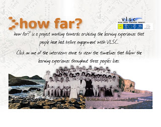
We were given our 2 man briefs. I am working with Lindsey and we chose the brief for Riverside Community Centre in Cardiff. This brief relates to Riverside's 'How Far?' project. How Far? is a project which records the 'distance travelled' in people's life long learning. This involves interviews being conducted with individuals. They are asked what they found was ok and not ok with what they experienced and learned in life. This is grouped under the headings of what they learned/experienced at Home, School, Work, in their Community, and what they hope for in the Future.

The Riverside community has been an independent charity running for 30 years. It has been an education provider for 5 years. There has been a focus on women, due to initially a direction of tackling gender inequality since the 1970s. But now they are working with men as well as women and minority communities. They are currently running I.T. lessons for the elderly Chinese community.

We had a meeting at Riverside with Allan Herbert. We discussed how to put Allan's Word document timeline which illustrates people's learning experiences, into a more interactive format:

· Allan stated that he would like a timeline representing someone’s life of learning, in an interactive and visual way.

· He would like it to be ideally easily updatable, a cd rom, that he could give as a tool to people to record the interviews.

· He liked the idea of clicking on part of someone’s story and more information appearing a box that zooms into view.

· The VLSC and European logos need to be on the Flash component.

This was a productive meeting, in particular with regard to learning about the client process. It was initially quite hard to unpack what the client was after. Also, Allan eventually wants a software application which the timeline would be an updatable template that people could just add their stories and text by clicking directly onto the speech bubbles and popups.

Saturday, January 06, 2007

Flash Brief Completion

The Flash Creative Brief has now been completed. I am pleased with the final outcome. I think that we achieved all that we set out to, and the client was very pleased with the final product. The main difficulty we had was they we were more developers than designers, so the design was according to our skillset and abilities. However, the client was happy with the layout, colour scheme and design.

Here is the final design of the menu:


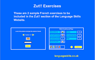
Here is the design of the food exercise:
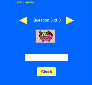


Here is the final outcome, delivered to the client:

My writing exercise:
http://www.d10dev-studio.com/ZoeBritnell/food/food.swf

Shamim's match them up exercise:
http://www.d10dev-studio.com/ZoeBritnell/shamim/flags2.swf

For the purposes of D10, and incorporating the 2 exercises under one menu, I created a menu to link them together. This was initially challenging, as the first menu, when you clicked and entered into one of the exercises, the buttons would not work as they were looking for the base level 0, which was now the menu movie.swf, not the French exercise movie swf file. To work around this, I used loadmovienum, so that when the exercise was loaded it was then the new level 0.

Here is the link to the menu and the exercises:
http://www.d10dev-studio.com/ZoeBritnell/menu/menu2.swf

Presentation to Client

We had our final meeting at Sequence a few days before the final deadline. This put pressure on us to make sure that we had the final product to present ahead of schedule, but we managed it. Phil and Steve were at the meeting again, as was the client, Cath Murphy. They were all very pleased with what we had achieved in the time frame. They were especially pleased that we had managed to tie the exercises in with the XML files. Phil stated that we had 'over delivered' in the sense that we had delivered over and above what they had expected.

As we had already uploaded our exercises, the client had some changes that she wanted us to do before the final deadline. This was a productive meeting to be able to have some valid experience of meeting a client, although in the 'real world' we would have met the client at the beginning of the project, not at the end. Never the less, the changes she requested were minor, and as follows:

*To make the instructions for the exercises as generic as possible for all writing and match them up French exercises, so they can be used in the future.

*To remove the exit button as it was not needed.

*To make sure that the exercises would be able to pull in the XML data on a loop basis, so that they would be capable of up to 10 possible answers per question.

*To remove the title on each exercise.

*To make it clear that the instructions are non-interactive and not part of the actual quiz.

*To create a page where the user can choose whether to read the instructions or go straight to the quiz.

We had already anticipated and planned to make some of these changes, and we set about implementing them in the final few days of the brief.

Overall the client was very happy and said that she like the design and layout of the quizzes and would be interested in working with myself and Shamim in the future.

Flash Build

Having ascertained the scope of the project and which direction to take we set about our respective tasks. Shamim had already begun to research the drag and drop technique, so he continued to develop a match the flags French exercise for Year 7. I decided to do a writing exercise for the same age group, so I took on the food French exercise.

We have already designed some initial mock ups of the exercises, and began to now build them in Flash. In building the writing exercise, I initially used arrays to pull in the picture content. Only after further training in XML was I able to finalise the exercise with adaptations to accomodate the XML.

We carried out some testing with other people and other versions of Flash. Here were the findings, which we implemented:

On the writing exercise -
*When you click on the check button and have got the answer right, the next arrow should flash, to encourage the user to go onto the next question.
*There should be a results page at the end with all the possible correct answers.
*A moving cursor and a border around the instructions, so it doesn't look interactive.

Match them up exercise -
*To make the text and flags larger.
*To adjust the actionscript so that it is not possible to drop 2 flags on top of eachother.
*To have some feedback on how well they are doing.

Base Camp

Back at base camp we drew up a Gantt chart, to monitor how the project is going, and to set key milestones. We also carried out some research on offline and online language exercises, to broaden our ideas on what to do. We looked at the following sites, at it stated on the brief that the client is looking for something like this -
www.oswego.org/ocsd-web/quiz/mquiz.asp?filename=salut
www.oswego.org/ocsd-web/match/dragflip.asp?filename=hobbies

We liked the simple style of these exercises, which suits the age range that we are aiming at - 11 year olds. These exercises had large buttons and text. It was obvious what to do, and there was good use of pictures and feedback where needed.

We also looked at www.vocabulary.co.il/ , which had an example of a hangman game exercise, and a multiple choice quiz.

www.bbc.co.uk/schools/primary/french had a good menu to follow.

http://funschool.kaboose.com/arcade/language/index.html has number language games.

We also looked at the Eurotalk Interactive Learn Italian cd roms for children. This was good to see how they, for instance, do 'match them up' exercises. However, the design was not that great and the naviagtion not very simple.

Sequence Meeting

Our first meeting at Sequence was with myself, Shamim, Phil Murphy, and Steve Brewer - a web developer. This was a very productive meeting as we established what they were expecting of us. They did not was a CMS system, Sequence have one set up for this website. They just wanted us to create the exercises to feed into the XML files. Also, we checked with Phil that it was ok to go ahead and create 2 French exercises for Year 7. They were pleased, as these exercises are aimed at the younger end of the age range, which is well suited to Flash exercises as it makes them more visually appealing.

We also established that they wanted us to use the existing pictures on the website. This was good news, as both Shamim and myself are more developers than designers, so it meant that we could concentrate on the technical side.

I knew after this meeting that it was vital that we created the exercises so that they worked with the existing XML files, as this is what the client was after.

Flash Creative Brief

Towards the end of the Christmas term we were given our Flash briefs. I am in a team with Shamim and we have been given a brief from Sequence. This is quite a challenging brief as it requires us to adapt some exercises from DHTML into Flash, drawing the content from XML files. As both Shamim and I have limited previous experience in Flash, and XML is completely new to us, this was going to be a fast learning curve. We have been asked to adapt some exercises from the website: www.languageskills.co.uk . By creating some of these exercises in Flash 8, and using the XML files, it is hoped that we would develop an authoring template, whereby future adapations of existing exercises into Flash would be build using this template.

One of our first questions to Phil Murphy at Sequence would be are they also asking for a CMS, as mentioned on the brief. Also, the scope of the project is needed to be narrowed down as there are hundreds of language exercises on the website, and we need to check which ones they would like us to build.

Monday, December 04, 2006

Flash Slideshow

Here is a slideshow that I created in Flash:


pluginspage="http://www.macromedia.com/go/getflashplayer" />

Flash Training

Last week we had Flash training. This was great training as we covered alot of the basics. We were taught how to do motion tweening and shape tweening. We also learning about buttons, movie clips and graphics. It is important when creating a flash movie that you don't generally draw straight onto the stage. One of the times you can do this is to create a mask. However, you generally create a graphic for a still image, a movie clip if you want to apply tweening etc, and a button speaks for itself.

We also created a basic flash photo gallery using actionscript controlling the movie. I also enjoyed creating a MP3 player, using actionscript to show the position and duration of the song.

Here is a motion tween I created, with the car following a motion path:


Monday, November 27, 2006

Sounds Like Music

Last week we had 2 days training on creating sounds and music. The first day consisted of an overview of Audacity, which I had used once before when we created our digital stories. It was good to have a more detailed rundown on how to use this software. We were also given a general overview of the different file formats for music such as mp3, wav, aiff, oggs and midis. I hadn't previously realised that midis work abit like xml files, in that they are a way to store information and a 'container' for music. For instance, on the second day we had a look at Reason and imported some music midi files. I used the track 'Men in Black' and assigned different instruments to e.g. the drums, guitar etc on the track. It sounded similar to the original, but not the same. On the first day on Audacity we all recorded our voices with reading out lines of a section in the novel Moby Dick, and then saved them as wav files. We then imported them all into Audacity and tried to alter the levels of each person's file to obtain similar sound levels. We were also taught about 'clipping' which means when the sound that has been recorded or imported is too loud and 'clips'. You can then then use the effect of 'normalising' the levels to sort this out.

It was a helpful couple of days, although I think I will need to practice making music in Reason to become more comfortable with it.