
This was the design that we decided to have for the timelines.
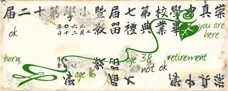
It varies for each interview, depending on the assets that we were given. We only had photos from the person who grew up in Hong Kong (interview one, on the timeline online). This was great to have actual photos of the person, and it was unfortunate that the client was unable to obtain photos for the other 2 interviewees.
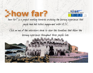
This is the menu design for the How far? timeline:
 This is an example of the design for a popup which appears when the user clicks on a speechbubble:
When we user tested the timeline, the following points were raised:
It isn't very clear to click on the speechbubbles.
The writing for the interview one in white looks too much like a button.
To resolve this we made the speechbubbles 'pulse', i.e. get larger and smaller so you notice them as interactive. We also changed the font on the interview one, to match that used on the jpg images, so it doesn't look like a button.
Overall, people liked the way the timelines worked, and thought that the design and functionality was good.
